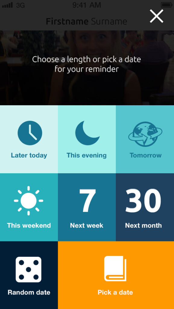
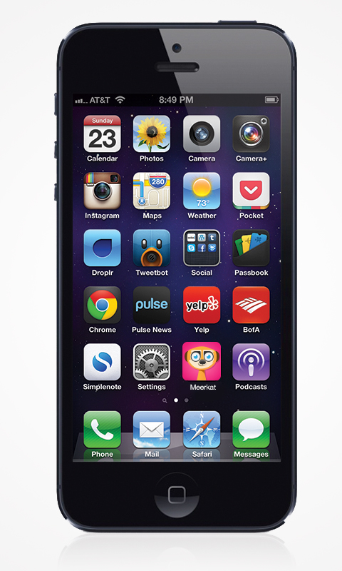
I’m not sure how this idea has aged since 2013, but I’ll let you the reader decide.
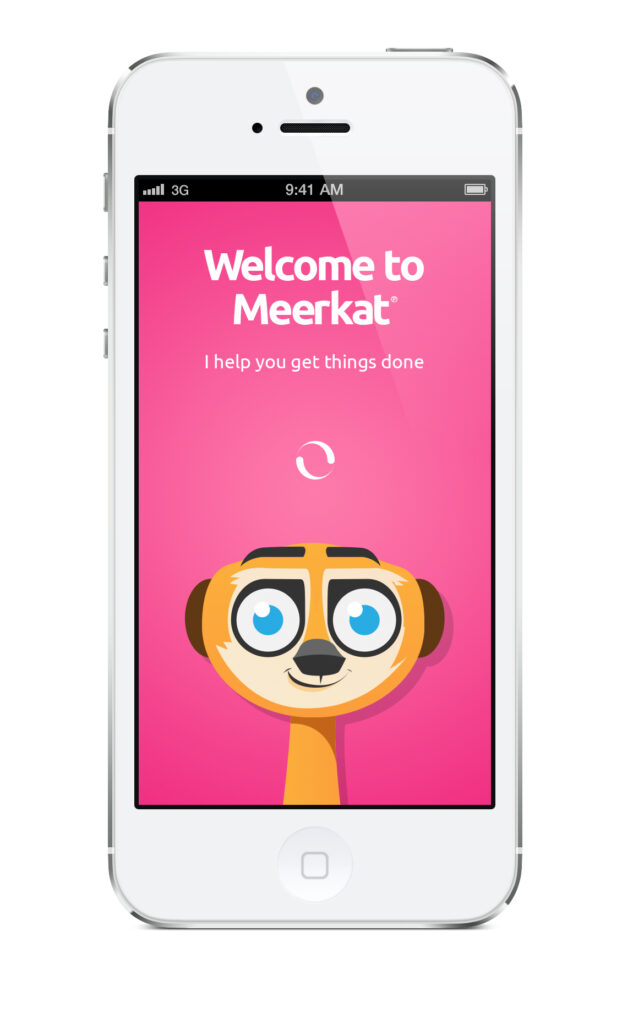
So, it’s hard staying in touch as you grow older. Life distracts you in many ways and both your business relations and your personal ones kind of shrinks. What if there was a helpful meerkat to remind you of contacting your loves ones once in a while? That’s Meerkat App.
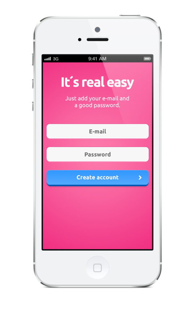
In 2013 I had done a few e-commerce projects for the same client and we decided to make the Meerkat app reality. I was tasked with everything design-related. From the UI of the iOS app to the marketing material, copy and website.
Scope
- Brand profile
- Logotype
- Website design
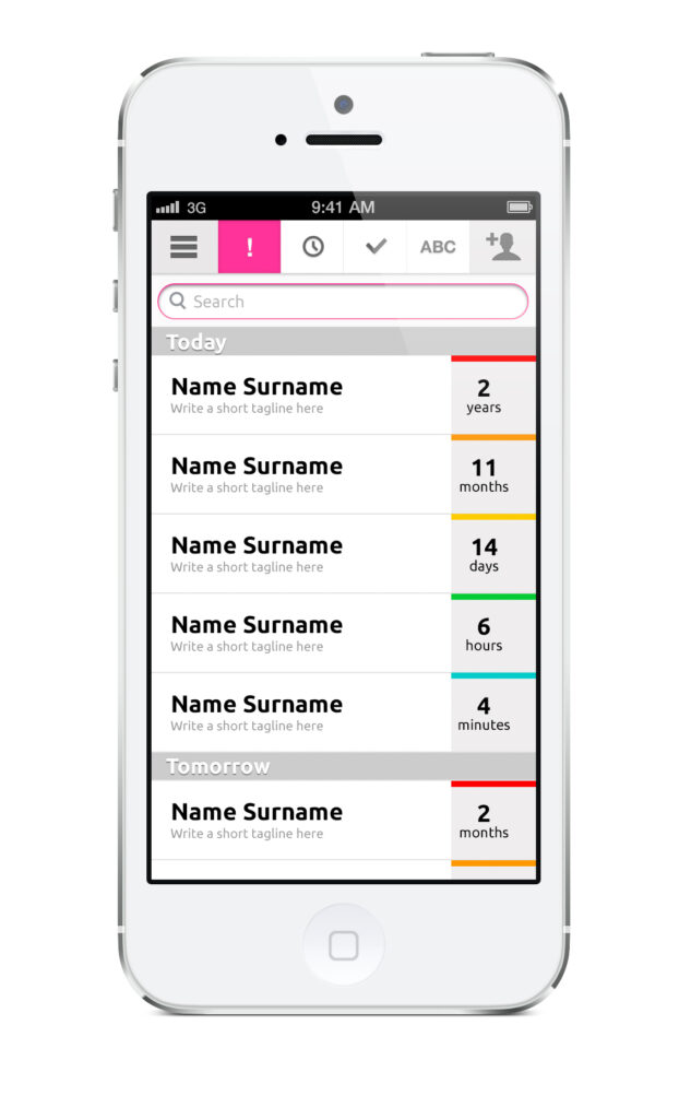
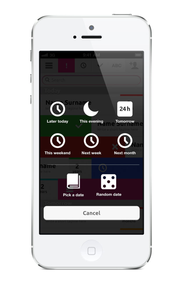
- UI/UX of iOS App
Project date
- 2013

Meet Max the meerkat
The helpful little friend popping up from time to time helping you stay in touch with your friends and loved ones. Max was designed to give the app a personal and friendly tone-of-voice. Before he existed, the app sounded pretty steril and didn’t give off that helpful friendly vibe.
App icon
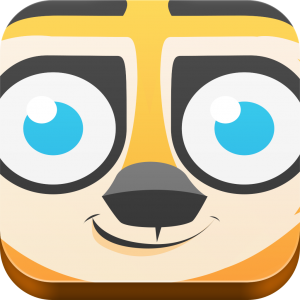
Must say I’m still quite fond of the icon. Stands out from the crowd and Max is always keeping an eye on you.
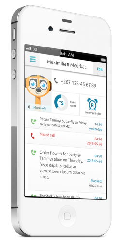
iOS 7!
I can’t believe the iPhone was that tiny. And check out the native iOS UI in the last image, so cute.
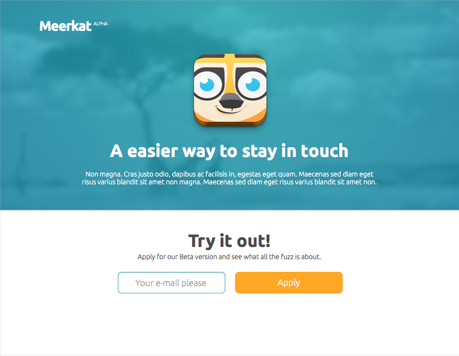
Website
Simple conversion page built with Webflow.
Project Outcome
Go Max, go!
Max the Meerkat had a short but sweet run on the Appstore. I think this was my second iOS app I designed, so still a lot of learnings in smaller screen sizes.
