This gives guests and the organisers ways of sharing their memories online with others, increasing the online social impact of their event.
At Tuzame, I was tasked with creating their brand profile, logo, website and all the branding fundamentals a company needs to get of the ground.
Scope
- Brand profile
- Logotype
- Illustrations
- Website design & WordPress theme
- Various marketing material
Project date
- 2014
Logotype
The customer wanted something that signals energy, playfulness yet trust. In my opinion, I think we nailed a pretty unique look with a solid philosophy reflecting the purpose and vision of the company.
Events – A place where people meet.
A place where memories are created.

A place to share those memories with others.
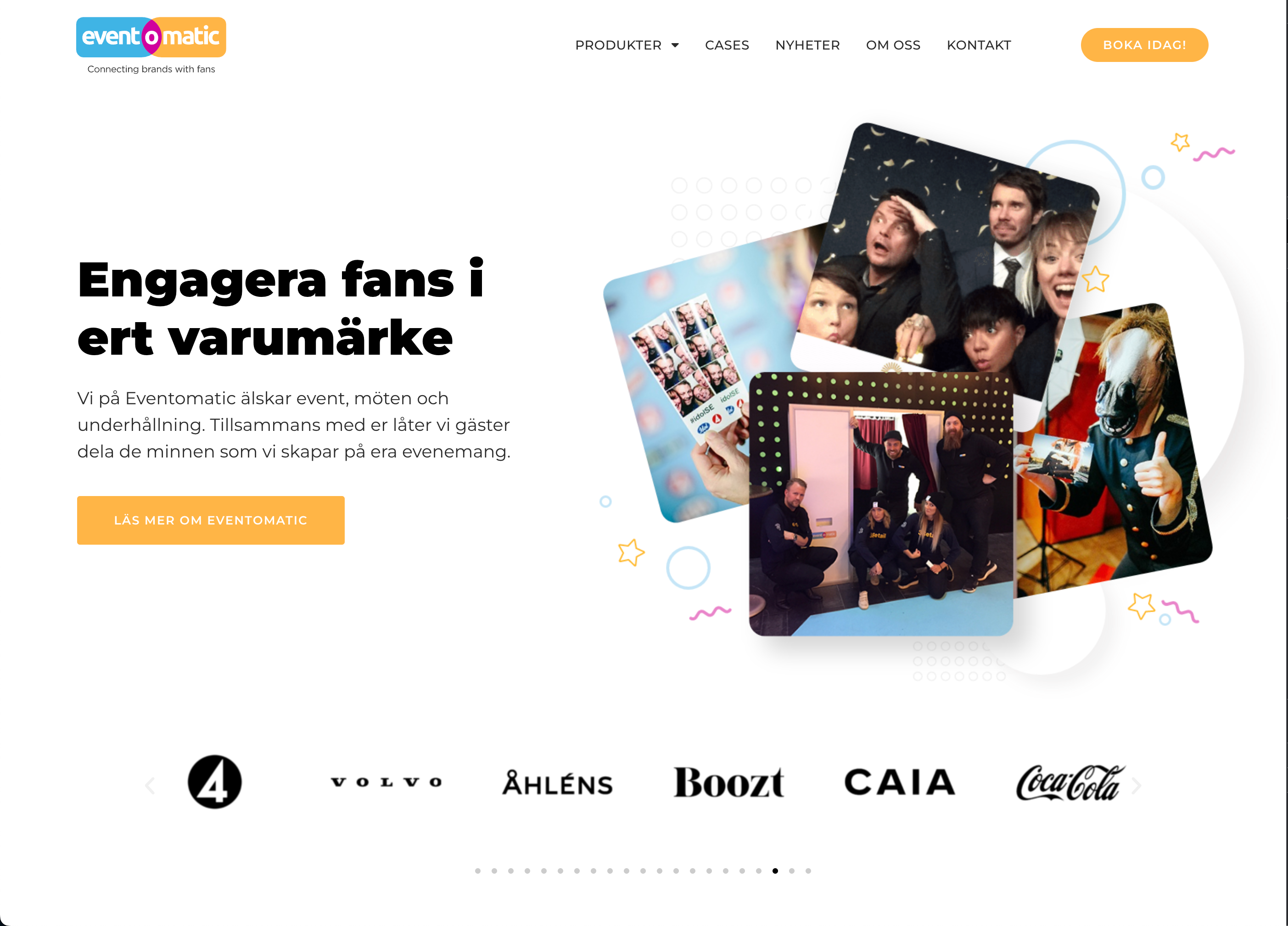
Website
Simple custom theme designed with conversion in mind.
Typography
For a bold confident feel, Montserrat was selected as the main font complimented with Merriweather for various text.
Cyan
Pantone 298 C
C64 / M10 / Y1 / K0
R56 / G181 / B230
#38b5e6
Magenta
Pantone 235 C
C21 / M97 / Y0 / K0
R208 / G0 / B158
#d0009e
Yellow
Pantone 1365 C
C0 / M34 / Y80 / K0
R255 / G181 / B69
#ffb545
Illustration example
A mix between flat design and isometric vector illustrations using the brands main colors.
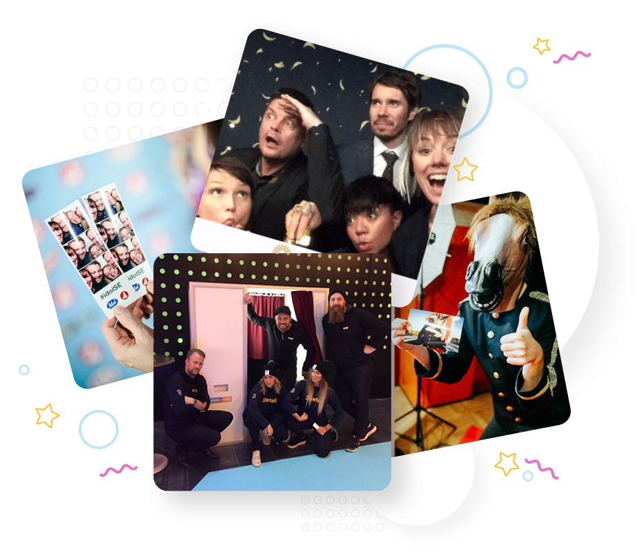
The guest snaps an image during your event.
The guest tags and uploads their image to social networks.
The photo is automatically printed from the Eventomatic Instagram printer.
Target audience
The brand should mediate a fun and social character to attract both companies looking for organising events as well as the gusts attending. Maintaining playfulness and a professional touch.
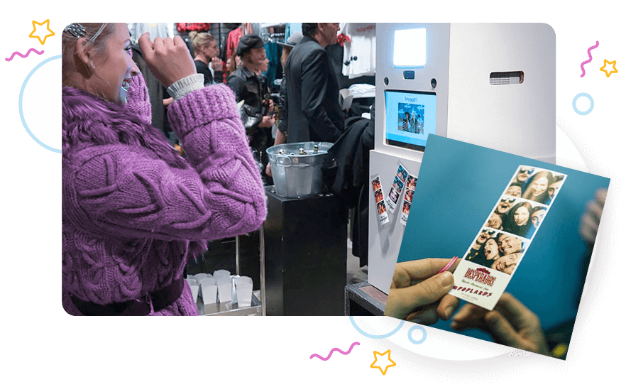
”Our social media driven services help customers not only be seen before and after the events but also during the event in a creative, playful and memorable way.
Project Outcome
A fun experience with lot’s of color
A happy gang of people wanting a happy new brand. Can’t find a better fit. Good luck to the team and all your crazy innovations!